Telerobrawl
Hello folks, and welcome back to another edition of Box Art Brawl!
Last week, we looked at the ridiculously titled Layton’s Mystery Journey: Katrielle and the Millionaires’ Conspiracy – Deluxe Edition for the Nintendo Switch, and it was the Japanese box art design that won the day with 68% of the vote. Well done!
Now, we’re going back to the Virtual Boy to check out Teleroboxer, one of the titles confirmed to be making a comeback when the console is added to NSO in the new year. Released in 1995, it was director Yoshio Sakamoto’s next game following the critically acclaimed Super Metroid in 1994. Sadly, Teleroboxer didn’t enjoy much acclaim by comparison, but it certainly has its fans.
No European art for this one, naturally, so it’s a heated duel between North America and Japan – let’s get to it!
North America
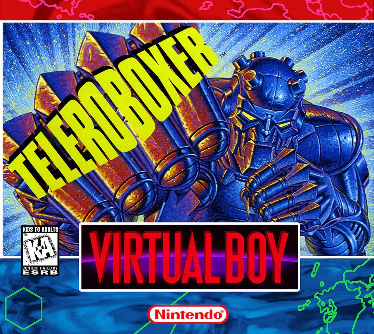
Whether you opt for the North American design or the Japanese design probably hinges on one question: do you like colour? If the answer is “yes”, then you’ll probably like what we’ve got here. The blues, the yellows, the reds, it all just comes together wonderfully to create one of the most eye-catching designs we’ve ever seen.
Even if the game itself isn’t a masterpiece, this artwork goes hard.
Japan
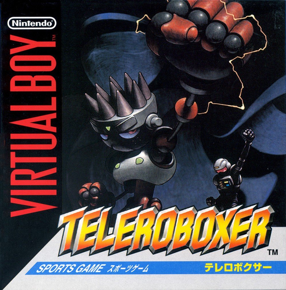
Japan’s approach, meanwhile, is a lot more subdued. The characters are still striking pretty cool poses, and there’s definitely a bit of symmetry going on with the Western design as a result. Nevertheless, while we’ve still got a bit of red and yellow going on, the blue has been almost eliminated completely for a much darker, moodier piece.
Thanks for voting! We’ll see you next time for another Box Art Brawl.
![]()
Nintendo Life’s resident horror fanatic, when he’s not knee-deep in Resident Evil and Silent Hill lore, Ollie likes to dive into a good horror book while nursing a lovely cup of tea. He also enjoys long walks and listens to everything from TOOL to Chuck Berry.