Shadow of the Ninja Reborn: peak pixel art from Tengo Project

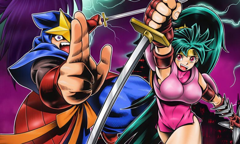
Shadow of the Ninja Reborn is a beautiful, hard-as-nails action game from developer Tengo Project. The fourth entry in Tengo’s 16-bit taste remake series, it’s also arguably the most ambitious. Prior releases from Tengo Project, such as Pocky and Rocky Reshrined and The Ninja Warriors Once Again, were based on games that already existed in 16-bit form, making the transition easier to imagine – but this new game is based on an 8-bit NES game instead. As a result, everything needed to be completely re-imagined from the ground-up. From gameplay to visuals and audio, this is a masterpiece of pixel art action that simply must be experienced if you have any love for classic gaming.
To refresh your memory, Tengo Project is a three-man group of creators that previously worked on classic Natsume games dating back to the 90s. Starting with 2016’s Wild Guns Reloaded, the team has continued to craft new takes on titles they had worked on decades ago. The result is some of the finest pixel art ever to grace a screen. Tengo’s latest releases answer the question – what would games look like if designers had continued to focus on 2D pixel art rather than polygons?
Shadow of the Ninja Reborn sees the developers take their art one step further. With prior releases, you could directly follow the visual lineage from Super NES to the new Tengo Project releases. However, the new game is a remake of a 1990 NES ninja action game. Essentially, this is the first time where the designer had to create an original art style from the ground up rather than simply expanding on the prior work. Instead of adding detail to existing art, the entire visual design has changed, bringing it more into line with other recent Tengo titles.
The NES original leveraged black space to create deep shadow on a system with a very limited color palette – a technique employed by many great developers late in the life of the system, creating a sensation of depth through careful use of colour and shadow. Instead, the new game aims for a level more in-line with late 90s-pixel art, the likes of which we could have seen in classic Capcom and SNK titles. The game breaks free from the grid-like structure of the 8-bit artwork presenting scenes that work more as a singular cohesive piece.
The underlying level layouts also change and the placement of challenges and foes is more nuanced and varied. I would describe the new level designs as being inspired by the original game more than an actual remake. This extends to boss battles which are extended and feature additional phases. This first boss, for instance, has very few patterns of attack in the original game and can be dealt with quickly. The remake, however, not only increases the size of the boss but expands its arsenal.
The second stage kicks things up a notch – the initial segment closely follows the original game and, like that original, an entirely new set of enemies is introduced requiring new strategies. The initial section leads to a showdown with this metallic worm before reaching a vertical shaft. Here’s where we start to see unique mechanics come into play – there is a new type of jump activated by tapping jump and down while in mid-air and this gap is there to force you to learn it which can cause frustration if you don’t realise that such a move is available. Detail is increased across the board, encompassing both sprites and animation. There are many frames of animation used for every character including the hulking bosses.
As you might imagine, the changes go beyond visuals. The gameplay has been altered as well. This is where I think players might initially struggle but I would suggest sticking with it as there is a learning curve to the controls in this game. Upon first picking up the controller, your first reaction might be that there’s a delay in the jump mechanic but in time it becomes clear that this is all part of the design focused on commitment to actions. All of this is intentional in a way that the initially awkward jumping in classic Castlevania games is. It’s about timing your moves and committing to the outcomes – learning how to anticipate and go with the flow.
What I found was, with each new level, the initial attempt would feel overwhelmingly difficult – yet, after trying multiple times, you suddenly get into the groove and blast all the way through. It is challenging but it’s not unfair and that’s the key. The fourth level is an interesting example of this: it’s a brand-new stage not in the NES original and it’s exceptionally difficult. I’ve seen negative reactions to this stage and I felt it too initially – but, once you come to grips with it, you’ll realise it can be defeated without taking any damage. That feels amazing and satisfying. In comparison, I think the original game is somewhat unpolished compared to Natsume’s later works, such as Shatterhand. The enemies often swarm the player and behave erratically, and your reach is very limited.
As you might imagine due to the nature of the game, there are plenty of versions available to choose from. The good news is that unlike Pocky and Rocky, which had a couple spots of minor slowdown on Switch, Shadow of the Ninja is flawless across every machine. I tested it on Switch, Xbox, PS5 and PC and I didn’t encounter a single hiccup or issue throughout. Like Tengo’s prior games, this is a showpiece for what’s possibly in Unity when creating this style of game. It feels authentic in a way that isn’t often true with Unity-built pixel art titles and that makes all the difference.
In terms of gameplay, I could shower it with compliments, but there are some nitpicks too. In the original 8-bit game, there were only a small number of weapons and they would change based on power-ups. With this remake, however, you always have access to your sword and the chain weapon but you can also collect and use many different sub-weapons. I think this is a pretty nifty idea that can create moments for additional strategy but there’s one big problem – the inventory menu. You need to hold R1 and cycle left and right. It’s OK enough but healing items are also buried within, making it tricky to access them mid-game. Perhaps this is intentional as it ties into the ‘plan ahead’ mentality of the design but, still, I found it frustrating sometimes.
The amount of moves available has been expanded as well – there’s the extended jump and wall running, but there’s also dashing. At first, these seemed somewhat useless but as I grew accustomed to the game, I found ways to work them into my play. Ultimately, the key here is that you cannot rush through – this game will punish you for sloppy play, which is how it should be. Overall, Shadow of the Ninja Reborn is another triumph for Tengo Project. As with their prior games, it’s a challenging game with a learning curve but I think it’s worth adjusting to as what’s here is simply a blast to play.


