How do you update a 30-year old pixel font to make it more suitable for today?
The pixel-art OpenTTD fonts are iconic, but were designed for 640×480 CRT monitors rather than today’s 4k monsters.
Without the horizontal smoothing of CRT scanlines, modern pixel-perfect rendering and 2x or 4x upscaling of the old bitmap/sprite-based fonts makes the text jagged and hard to read.
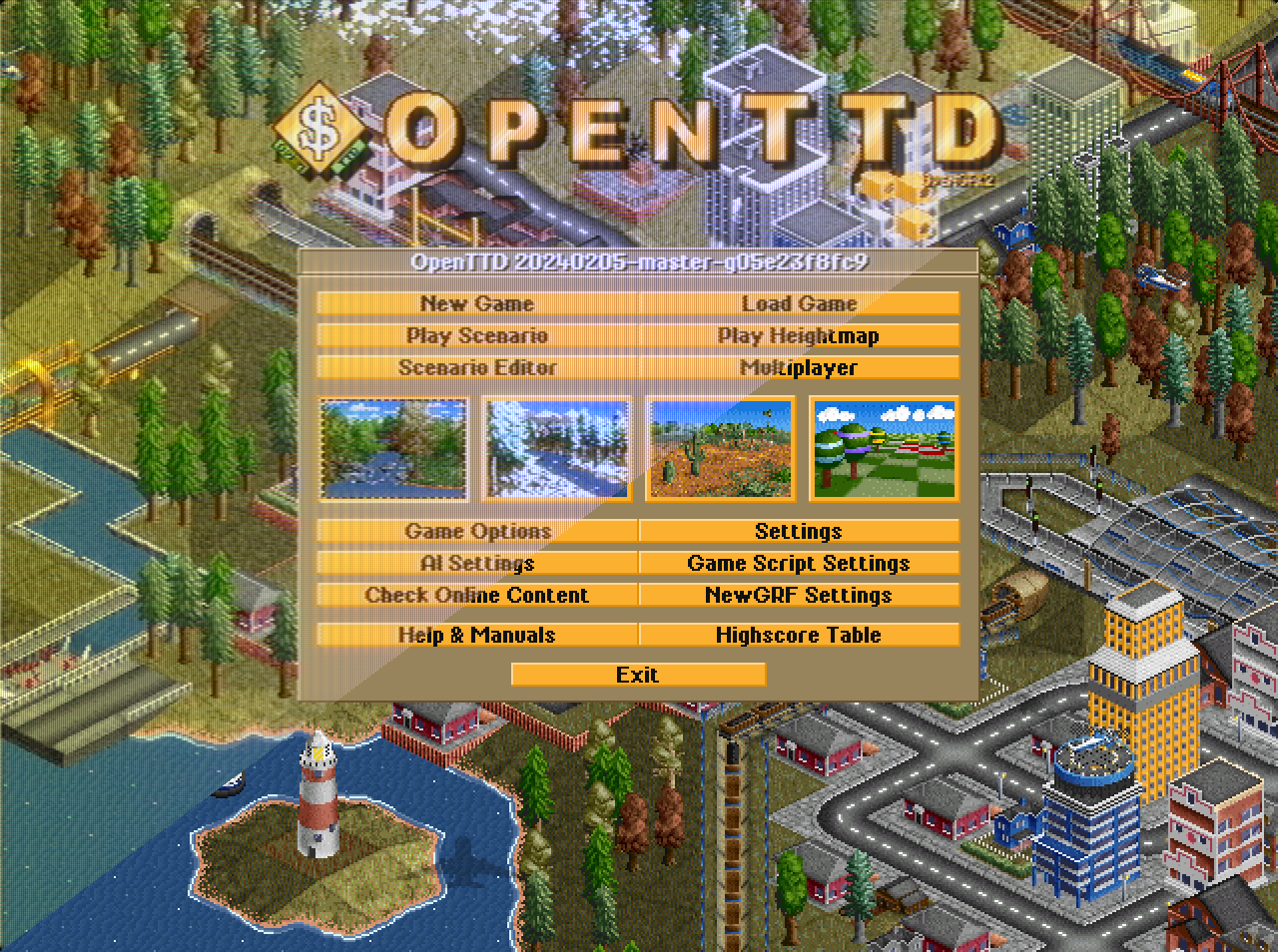
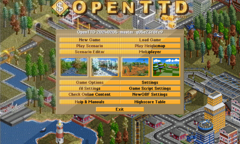
You probably don’t think of OpenTTD coming with fonts, but the normal, tiny and newspaper fonts are all built into the game.
They’re not a normal font format though, they’re one little bitmap image (called a sprite) per character.
So how do you update an old sprite font to make it suitable for today?
The short answer is “make a real font” – a TrueType font.
The smooth splines of TrueType font characters scale with no loss of details and no pixel jaggies, while anti-aliased rendering mimics CRT scanline smoothing.
Making a font which captures the look and feel of a pixel art font is an interesting challenge.
In my misspent youth I made some fonts from scratch, but designing a font to match the look and feel of a pixel art font is much more constrained.
In some ways this limits creativity, but designing with constraints can be better.
Scaling up 4x gives you 16 times more pixels to play with, and surprising room for expressiveness.
Design process
To keep the pixel art feel, I self-imposed some key design constraints:
Strokes and the extreme points of curves must lie exactly on a pixel grid.
Strokes must be an exact number of pixels wide.
Diagonals must have an integer rise and run (eg. along 1 and up 1 pixel, along 1 and up 2 pixels, etc.).
It is challenging to make nice character shapes within these constraints, but I think the result successfully captures the right style.
There are three main fonts:
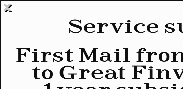
The newspaper/serif font was probably the easiest.
The font in the Transport Tycoon Deluxe original graphics is a modern serif/Didone-style with large x-height, open counters, heavy stressed strokes at a vertical angle, thin slab serifs for vertical strokes and large modern serifs for horizontal strokes.
It’s quite clear that it was originally designed as a sprite font, and making a TrueType equivalent was a relatively simple process of just drawing the characters to match the character size and style, sticking to the pixel grid.
The small font was the next easiest.
The original small font is 6 pixels tall and all caps – a very constrained space to work within! I took a geometric approach, building up a set of standard curve shapes that could be assembled to build the characters, making sure that the curves correctly filled in/left out corner pixels.
This gave a tiny font which looks very like the original at 1x size, but smoothed out while feeling pixel grid-based when larger.
The medium sans-serif font was the hardest.
It’s iconic, visible everywhere, and needs to be very readable.
The original graphics provide quite a distinctive sans-serif bold sprite font, but I needed to scale it up and add detail.
To get inspiration I used a CRT screen simulator (thanks ShaderGlass!) and even looked for photos of Transport Tycoon or OpenTTD on CRTs – both very informative for choosing character shape.
The horizontal and vertical strokes were generally easy to imitate, but the diagonals and curves were much harder.
I went through a heavily iterative process; drawing a character on the pixel grid, checking how it rasterised at 1x size with no anti-aliasing, checking where it differed from the original font, revising exact curve shapes, sub-pixel positioning of the ends of strokes etc., and repeating.
The end result is not your typical sans-serif, and has interesting quirks like the very vertical sides of “o” and the square caps on “v and “w”.
The challenges
The last big challenge was fitting everything in the very narrow line height.
The OpenTTD GUI has a very dense text layout, originally designed to fit many informative windows into a tiny screen.
There’s absolutely no space between lines: the bottom of a “y” touches the top of a “T” on the line below.
This means characters with diacritics (accents, etc.) require a special short letter shape, which the diacritic is then placed on.
This was hard for the serif, very hard for the sans-serif, and extremely hard for the small font!
I had to cheat with the small font, it’s a 7-pixel tall font pretending to be 6 pixels tall, but mostly works.
The opportunities!
Having spent the time to make these fonts it opened up a range of options for improvements.
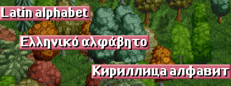
OpenTTD has a very international player base, with many players using languages which use the Cyrillic or Greek alphabets.
Having made the Latin alphabet, it was (relatively) easy to make Cyrillic and Greek alphabets, with full character coverage of all the OpenTTD translations.
It was also (relatively) easy to make a monospaced font based on the sans-serif font, for the in-game Readmes, Changelogs, etc.
Looking to the future, these fonts are complete for all European languages, but it enables easy future development.
Having dedicated fonts makes it easier to support more languages – we can guarantee a font is available with the necessary characters.
There’s also the possibility to add more currency symbols.
For now, the fonts just support European scripts, but there is the possibility of future support for other alphabetic and abjad scripts.
I’m afraid CJK scripts are probably beyond my ability though!
In closing
Overall, I’m very happy with the result and I hope you like the fonts too.
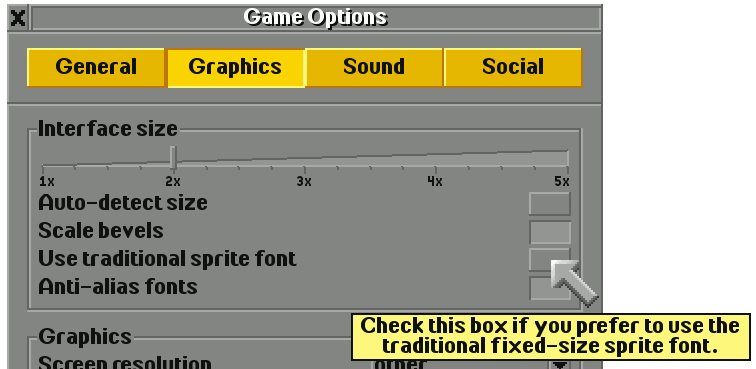
They’re included with OpenTTD in version 14.0 – just make sure they’re enabled in Game Options > Graphics, then toggle new vs. old fonts with the “Use traditional sprite font” button.
The font will look best if you set the interface scaling to a round number, exactly 1x, 2x etc.
They come built into OpenTTD, but if you really like the fonts then you can download and install them to use in your local word processor too.
Make your next school/work report OpenTTD-themed!
Grab a copy from the Github OpenTTD-TTF releases.
More about OpenTTD 14
This post is part of the series of dev diaries about big new features coming in OpenTTD 14.
Next week, we’ll see how pathfinding has been improved for one of the transport types.
And, oh buoy, is it a big improvement!