Microsoft is trying to reduce Windows 11’s desktop spotlight clutter
Windows 11’s Spotlight feature is a pretty nice way to jazz up your desktop background with different wallpapers and fun facts when you hover over the image icon.
The problem with the current approach is that it takes up a good amount of space on the desktop when you try to learn more about the wallpaper.
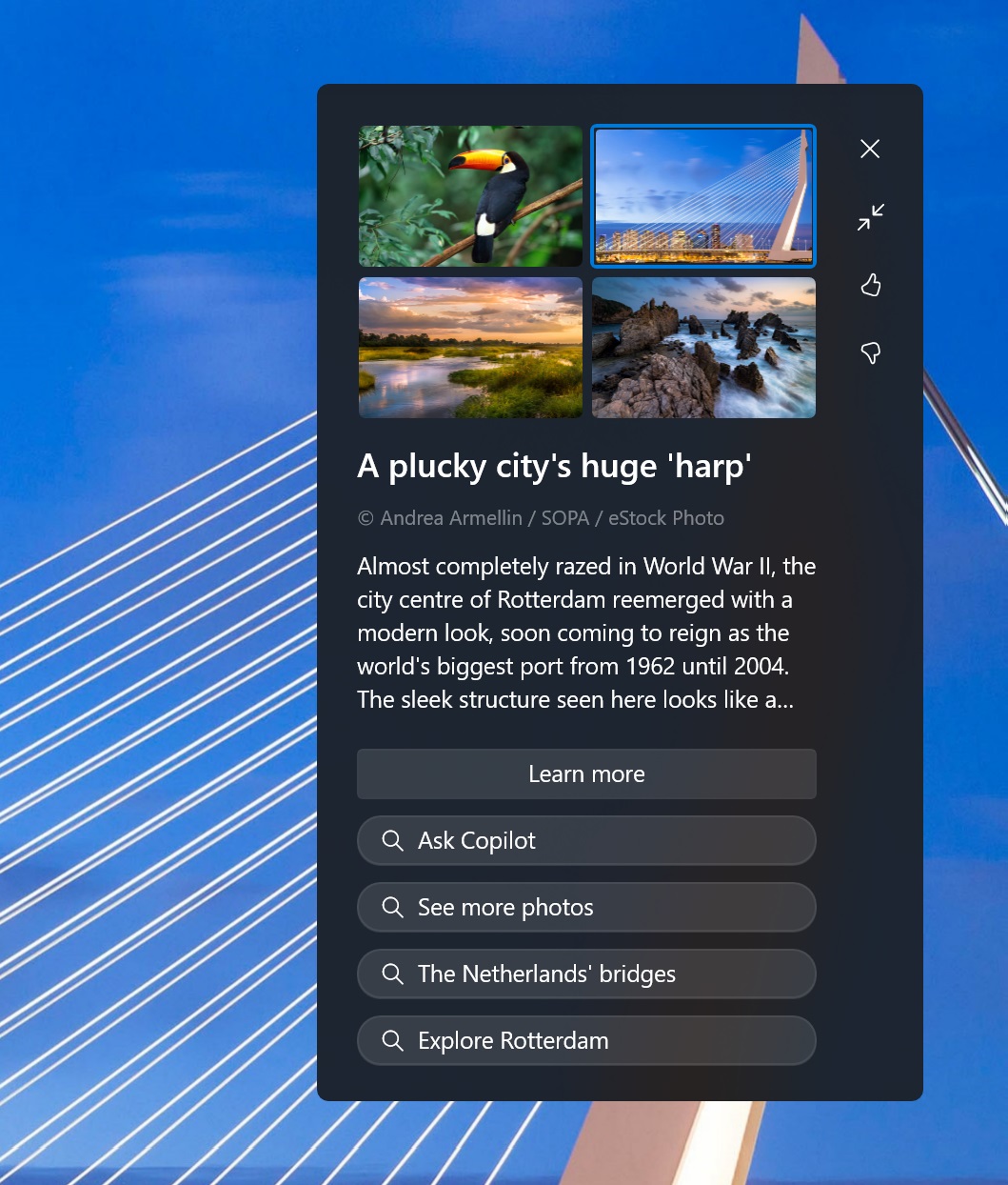
Source: BleepingComputer
As shown in the above screenshot, the Spotlight pop-up covers about 20% of the desktop space and links to Bing search results, including “Ask Copilot.”
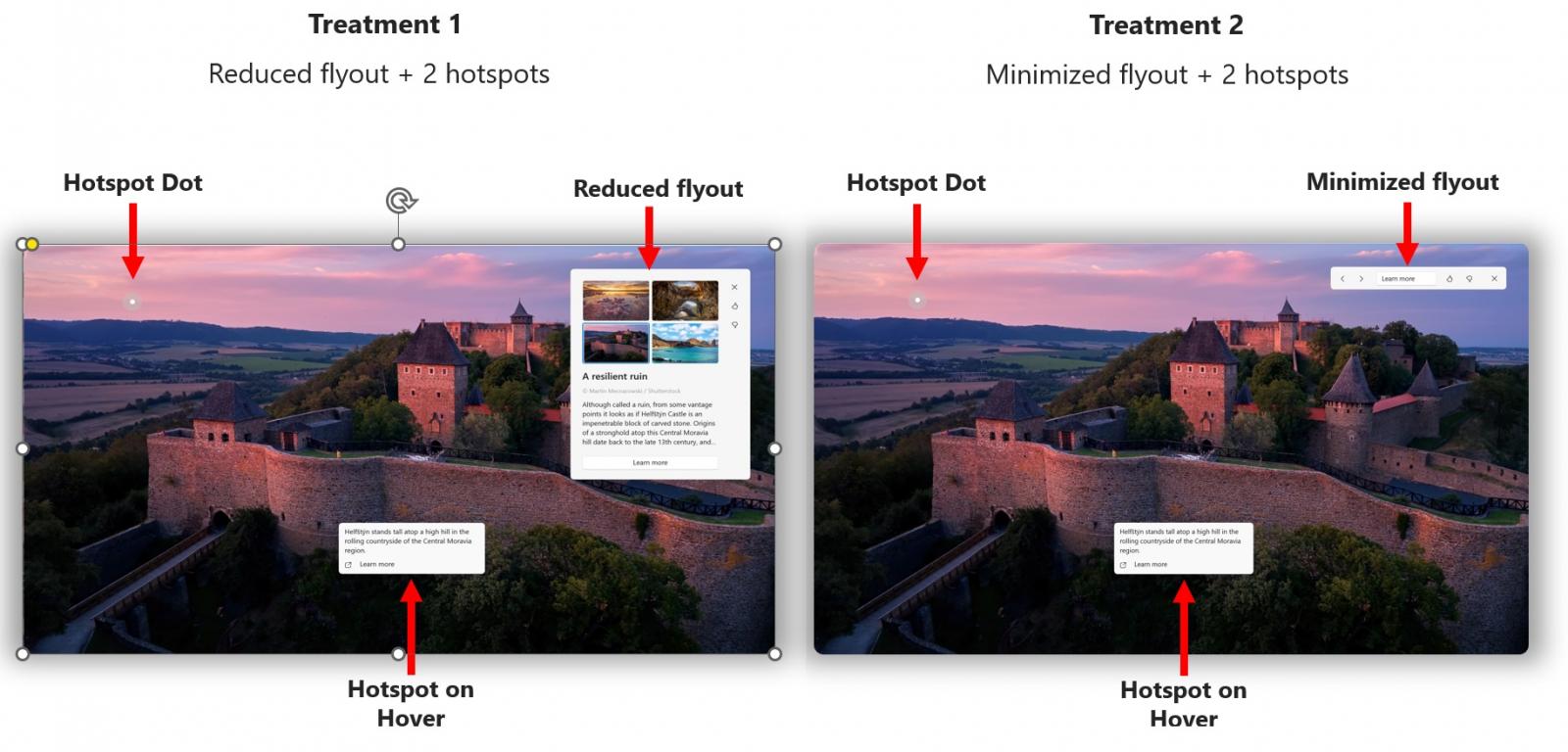
Source: Microsoft
Microsoft understands that some users might not like how the Spotlight feature takes over their desktops.
In Windows 11 Build 22635.4145 for the beta channel, Microsoft is testing some adjustments to the Spotlight experience on the desktop, including the addition of hotspots when users right-click on the Windows Spotlight icon.
In a future release, you’ll notice these Spotlight pop-ups with a reduced flyout.
“There is no change to the interaction model where right click opens the experience in full screen and double clicking launches the Bing landing page,” Microsoft noted in a blog post.
“When in full screen, you will now see two hotspots which will be animated to aid discovery, and which will reveal additional information on hover. Clicking on a hotspot will close the full screen experience and launch the Bing landing page.”
Microsoft also promised that the hotspots will reveal additional information on hover, so you no longer need to go to Bing to learn more about the Spotlight.
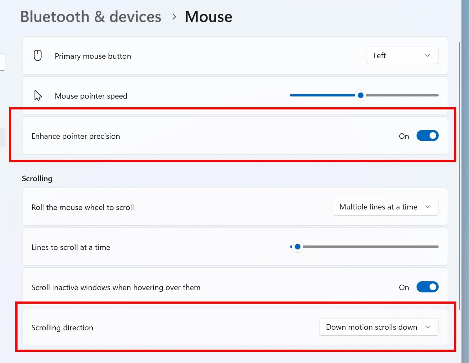
Source: Microsoft
In addition to a decluttered Spotlight UX, Build 22635.4145 ships with an updated Settings > Bluetooth & Devices > Mouse section, which now includes the option to turn off enhanced mouse pointer precision and a toggle for changing mouse scrolling direction.
These options were previously offered only in the Control Panel, but they’re now available in Settings.
