I’m one of those people who likes to upgrade to the latest OS versions but who also doesn’t give a shit about betas. I don’t read about new features in advance, I just upgrade when an upgrade is out. The other day I upgraded to iOS 18. And I have thoughts. Specifically on the redesigned control centre.
Some context is necessary. I’m on an old iPhone—11 Pro Max—and I run my phone in a very weird mode. I turn off almost everything because I want my smartphone to be the least smart possible. No widgets, no icons, no Siri, no notifications. My mindset is—every time I get a new OS—to figure out if I can make things even simpler. And with iOS 18 Apple has decided to give me more control over, among other things, the control centre. This thing:

A quick note before this post goes off the rails: Apple recorded almost 100 billion in profit in 2023. They can afford to hire every single UX and UI designer on the face of the planet with that money. Keep that in mind as you read through this rant.
Shapes
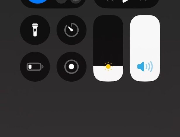
When I first pulled down the new control centre my first thought was “Circles?!”. Look I don’t want to be one of those people who just hate changes and always prefer the way things were before simply because it’s what they were used to. I’m no shapeist, I have nothing against circles. I just find it odd to use circles because the rest of the UI is still using squircles. But alright, let’s go with circles. But it’s not just circles. It’s circles AND squircles. Odd choice.
Icons
And what about those icons? Why are now some icons two tones? And why only some have completely arbitrary colours when active? Who designed this? Where is Jony Ive when we need him?
Interacting with this piece of junk
Ok forget the design, I don’t have to look at this thing all day so it is what it is. But the UX is a nightmare. Look at this screen recording and tell me if this is acceptable.
You add a widget, you resize it, and it disappears and you’re back at the initial screen. What happened? Very intuitive it has become a standalone page, as you can CLEARLY see from a tiny small icon on the right edge of the screen.
Also, a word on those stupid icons on the right. Why a heart? Inside iOS the heart is used for the health app. If the idea was to mark these as favourites—“What’s your favourite control panel toggle?” asked no one ever—isn’t a star the accepted icon for favourite? And the heart stands for “liked”? Again, 100B in profit, they could hire a few more designers.
Back to the UX, the widget has become now a fullscreen page. How do you get there? By swiping Up/Down. Since its inception, you swipe left/right to navigate across screens on an iPhone. Why are we swiping up/down to navigate screens here? It’s a stupid decision which is especially stupid considering you also swipe up to close the damn thing. Apple, what the fuck are you doing?
The wifi situation
Ok, let’s ignore the tragic UX. After all, this is one of those things that you set up once and then forget about it. At least I can now delete all the crap I don’t need to have in there and only keep a few items. Let me add a simple icon to toggle control wifi, it should be in the connectivity section. There’s a single toggle for mobile data, a single toggle for Bluetooth, a single toggle for airplane mode, and a single toggle for personal hotspot. No wifi. Why? Why Apple? You added a fucking single toggle for Print Centre. Who needs quick access to the print centre on an iPhone? The only way to control wifi is to include your stupid connectivity group that also includes another group inside because clearly you have the best designer on the planet working for you. But you people weren’t happy to not provide direct access to the wifi settings. You probably had a meeting and said “You know what could make the experience of using an iPhone better? More friction!”. So now, if I long press your stupid wifi icon in your stupid connectivity cluster, rather than opening up the quick wifi menu— which is what I want and what was happening in iOS 17—you show me this abomination of a menu:

And here I need to click a second time to access the menu. So congratulations, I now have to click twice to access a stupid setting.
Who is to blame here?
Well, the first person I blamed was Carl. I told him to get hired by Apple and go fix that mess but he doesn’t want to leave Scotland and only wants to work remotely. Shame on you Carl, I thought you were a true friend and true friends don’t let iOS turn to shit.
More seriously though, I have no idea what the hell Apple is doing. This is all insane to me. It truly feels like all the competent people are leaving and they’re shipping half-baked software just to hit some arbitrary deadlines.